
I was six months into my book project and although I’d learnt a lot about an erstwhile approach to a trade, about my personal resources and limitations, and had taken a trip to one of the world’s most important historical printing sites, I still hadn’t started printing my book. I was struggling to find the movable type that I needed to set up its pages.
I’d done what I could to work around this. My friend, a qualified copy editor, had kindly offered her services very cheaply; so, the manuscript had been pored over and was ready to go. And I’d gone through the delightful process of deciding what paper I was going to use. Actually, the decision had been made by another friend—the late Hugh Waller—a dedicated patron of the arts and a printmaker with a fine aesthetic sense. I’d requested samples from an Australian supplier of Italian cotton papers called Magnani. When I handed them over to Hugh, he’d stopped at a piece of the deluxe Revere Book Suede. Running his fingers over its velvety texture, his face had taken on a dreamy smile. ‘Oh, that’s sexy,’ he said. It was the most expensive of the options, but I was sold.
Buying 430 uncut sheets of the sexiest cotton paper necessitated my facing another of my big fears: driving in Melbourne. As a child I’d witnessed numerous Christmas morning navigation-related ‘carguments’ between my parents while en route to our cousins’ house for festive celebrations. These big smoke Christmases had not only made the day an ordeal for us country bumpkins; they’d also traumatized me into the early resolve that negotiating Melbourne’s hellish traffic maze was something I would never do. But as a 37-year-old I realised that I’d have to ‘face my grinch’ if I wanted to achieve anything at all. It was impossible to transport heavy equipment from my home to the museum and back again any other way. Sick with anxiety, I made the first of what would become many trips down on the freeway. I’d expected that first drive to cost me my fragile nerve and probably a hefty insurance excess; but I came away euphoric, my only outlay being the price of petrol, a Navman—and a trip to the osteo afterwards to relieve the tension in my neck.
Finding Bembo

The classic typeface called Bembo is the font I’d chosen for my book. Aside from the fact that there were two full cases of it in the size I needed at the museum, I chose this font because it’s harmonious to the eye in reading, and each character is ‘small on the body’, meaning there’s quite a bit of space around each letter where it sits on the line. This meant I wouldn’t need to add extra space (leading) between the lines when I set it into pages. I’d decided that I would compose and print eight text pages at a time: four per side of paper. But this meant that I’d need to source another eighteen kilograms of type! With the Melbourne museum unable to afford the outlay involved in getting its casting equipment up and running, I was forced to look elsewhere. Unfortunately, I couldn’t find any type founders in Australia; my closest bet was the New Zealand Printing Museum. I sent an email with the quantities of each character I was needing through to Dan, the Secretary, and was surprised to receive phone call from him less than thirty minutes later. ‘What are you printing, a Graham Greene novel?’ he asked.
It turned out that New Zealand didn’t have the matrix (casting mould) that would be needed to produce the type I wanted. I’d have to look further afield—to the other side of the world, in fact—to Massachusetts in America. In March of 2017, my two boxes of printing type arrived in the mail. From this photo, taken just after I’d opened these boxes, you can see that there never was another woman in the world as happy and relieved as I was to hold eighteen kilograms of metal alloy in her hands. All my Christmases had come at once—stay-at-home ones, that is. So began a very real love-hate relationship with printing type.


A Note on Spinning Lead into Gold
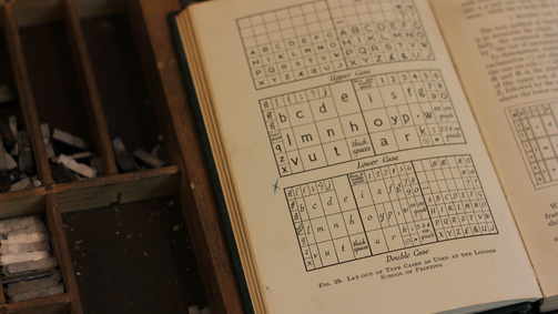
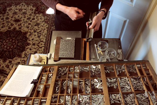
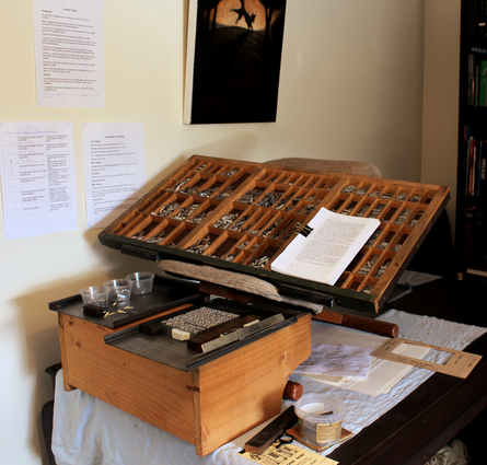
Type must be set with each individual character (sort) placed into the setting stick upside down; and each sort is taken from a case made up of 89 separate compartments. The apprentice typesetter (or compositor, as they’re known in the trade) must first face the challenge of learning where each sort lives in the case. Of course, one can use labels; but I’d heard an old-school printer liken the compositor marking her case to a concert pianist knowing his notes by taking to the ivories of his grand piano with permanent marker. In other words, it’s sacrilege. So, I’d decided that I was going to be a good little prentice and memorise the ‘lay of the case’.
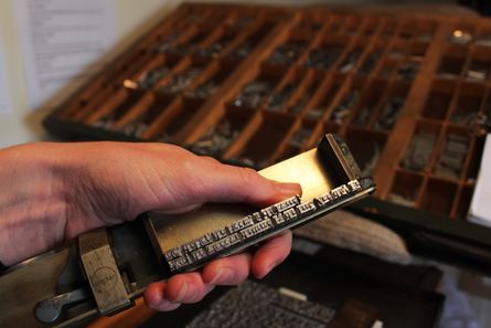
Aside from this initial learning curve, there’s the challenge that comes with handling type itself. Once the lines have been set in the stick, they must be manoeuvred out, placed on a tray (galley) and—when they’ve grown into a full page—tied up with string. Anyone who’s tried lifting a full word from their Scrabble rack might get an idea of what this is like; but these ‘tiles’ are stacked three or four high and contain lead. ‘Printer’s pie’ is the term compositors use for the mess left over when a manoeuvre fails, when they ‘pie’ their type. And I can say from experience that there’s a particular sound that compositors make when this happens, a cry of mingled frustration and anguish. My average page contained 340 words. The very first one that I set took me six squinting, exasperated hours, punctuated often by the compositor’s cry.
But typesetting isn’t without its redeeming qualities. When one knows the landscape of the case and has developed a feel for type itself—its very own physical and haptic qualities—it’s the supreme meditative act. There’s a focused peace and a deep satisfaction in building a page by hand. For me, typesetting is the perfect marriage of the technical and the creative.
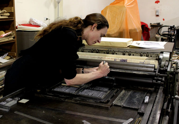
In May I braved the Melbourne traffic maze once again, proudly fronting up to the museum with pages one through to eight. Setting them had taken me two months of weekends—and I was eager to print. Michael helped me lock them up into my first forme—the relief model of my laid-out pages—and we fixed them onto the press, ready to go.
The Poor Little Drudge
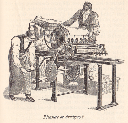
In his definitive, practical guide for amateurs, Printing for Pleasure, the legendary John Ryder says this:
Setting whole pages of small type, or printing more than fifty copies of anything, belong…to the composing-machine and the power-press. The thought of performing such tasks entirely by hand puts me in mind of Rutt’s press from Hansard’s Typographa where the poor little man turning the handle is undoubtedly something of a drudge!
At the start of my venture I’d gazed at this stooped little man cranking his handle and it had dawned on me that I was in for a very hard time. I had 136 pages to set and 160 copies to print by hand. But what I experienced from May through to August of 2017 made me envy this poor little man’s drudgery. If only my task had been to feed paper into a machine and crank a handle!
Write a comment
Kano (Saturday, 24 July 2021 01:30)
Wow, amazing you managed to tackle the freeway so many times for the cause!
Fiona (Saturday, 24 July 2021 07:05)
You’re amazing Beckstar, I would’ve been very happy to be your Melbourne chauffeur! I just can not wait to see the end product, what a journey!
Cath (Saturday, 24 July 2021 18:26)
Beck, I think you are ready for the Typesetting Olympics.
Your focus and eye for detail must be so highly attuned after five years of dedication.
I’m in awe of what you are achieving.
Thank you so much for sharing this unique journey.
Beck Sutton (Sunday, 25 July 2021 02:31)
Thanks, Fiona, but it's probably just as well I put on my big girl pants after fifteen years of driving!
Cath, I appreciate your kind words. So happy to hear you're enjoying coming along for the ride (:
julie (Sunday, 25 July 2021 02:44)
Beck,
I love reading the story of your book's creation... you are amazing!
Beck Sutton (Sunday, 25 July 2021 03:21)
Thanks, Julie! (:
Aime (Sunday, 25 July 2021 16:09)
Thank you for sharing the process of making the book Beck. I think that a book about making the book would be wonderful to print as well (not by hand though). I admire your dedication to the project and your uncompromising approach to authentically applying these traditional approaches. Thank you for reviving this piece of history and culture and applying it to a new context (your book).
Phil (Sunday, 25 July 2021 20:12)
Reading this latest episode of your odyssey reminds me so clearly of why offset lithography took off so speedily in the 1960s. It is just so much simpler! The most difficult part was still the setting of the type, and I will come back to that, but once set it was an easy 3 step photographic process to produce the printing plate, which was a very thin sheet of aluminium. This sheet was then wrapped around the drum of the press, inking up the rollers was an identical step to letterpress but her was an extra roller, the damper that kept the plate just damp, and the ink therefore sticking only to the type image and not the whole plate. The inked plate was then brought into contact with another cylinder which had a rubber blanket wrapped around it and the image therefore transferred, or "offset" to this blanket. Finally the paper was fed between the blanket cylinder and yet another smooth metal cylinder called the impression cylinder and the page was produced. It all sounds a bit complex, but in reality was quite simple. The tricky bit was still setting the type, but I might come back to that another day!
Beck Sutton (Sunday, 25 July 2021 21:01)
Thank you Aime. I'd love to write a book about the making of the book one day--it's on the list of projects!
Phil, thanks for sharing your experience with lithographic printing. It's fascinating to learn about the different steps in the development of this technology. Isn't human ingenuity amazing?
I'd love to hear you say more about setting the type in preparation for creating the plate. I don't know much about that 'intermediary' period where offset printers were still using type.
Beck Sutton (Sunday, 25 July 2021 21:06)
Incidentally, if anyone's interested in learning more about the difference between letterpress and offset printing methods, see the link at the bottom of the page to my blog post about this.